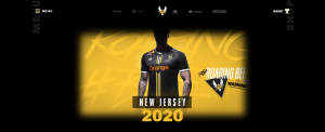
Why the need for an Esports Website?
Every business needs a website. If you want your esports organization to be financially successful, you have to start treating your esport organization as a business rather than a hobby. So I want to breakdown how your esports website can look and give you examples of great websites within the esports industry.
I want this article to focus more on the design and structure of the websites rather than on a particular platform, but do I want to add that I have recently used Webflow to build a website, and I love it! Would recommend. #notasponsorbutitcouldbe
About
When I am building a website, one of the things I struggle with most is the About page. I want to give the information the user is searching for without being overbearing with information. Therefore, I try to adopt the user’s mindset and ask myself what I want to know about this company.
For example, I want to know your history. Everybody loves a good origin story, so start with that. Next, I want to know who your partners/sponsors are. Maybe it’s the marketer in me, but I want to support the companies that sponsor my favorite teams and streamers. Make sure to display your partners around your site.
The next thing to showcase on your About page is your accomplishments. People want to follow teams that win, so if your organization has won, brag about it. An excellent example of this is Spacestation Gaming.
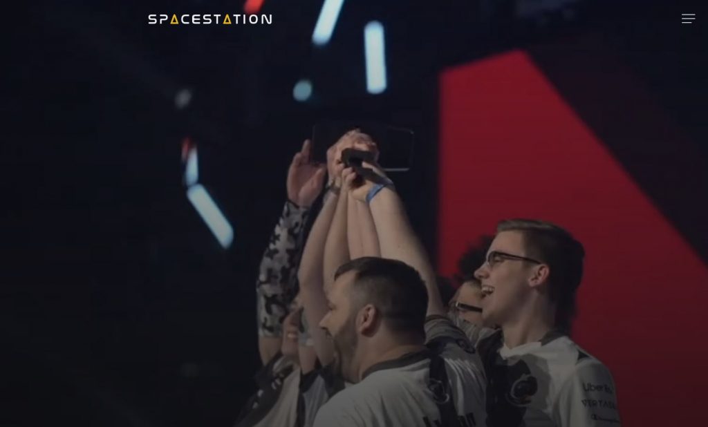
When you load into the Spacestation website, there is a video showing their team winning the Rainbow Six: Siege Invitational. Maybe the most significant piece about your organization is the people. It is up to you if you want to include them on the About page or have them on a separate page.
Roster(s)
The next aspect of your website that you should showcase is your roster(s). If you have teams competing in different games, display that on your website. One organization that I think does this well is G2.
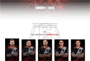
They show the games that they compete in and the rosters for those teams. The Roster page shows the player’s social media links and a little bit about each player. Plus, on the Roster page, they show that team’s achievements and results from the latest matches. This might be a good place to put your upcoming schedule. You will also want to showcase your content creators. Cloud9 has a tab on its website called C9 Live. The tab displays Cloud9 members that, you guessed it, are currently live streaming. Now that people know and love your organization, it is time to give them a channel to support you directly.
Store
To grow your brand within the esports industry, you need strong merchandise. Your store will be the place to display that merchandise. Before we talk about your store’s structure and design, can I please ask you to have the page open in the same window? 1) I don’t want more tabs open, and 2) opening the page in the same tab will make tracking conversions easier with Google Analytics.
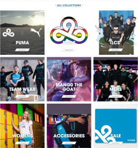
Let’s try an experiment. When you think of esports merchandise, who is the first brand that comes to mind? For me, it is 100 Thieves. Are they an esports organization with high merch sales, or are they a clothing company that participates in esports? Either way, they know merchandise sales. It would be best to organize your store by product, team, or game in which your organization competes. Featuring new releases is also a good practice. One organization that does this especially well is Cloud9. Their store is arranged well and features various products.
Non-Essentials, but Nice
Press
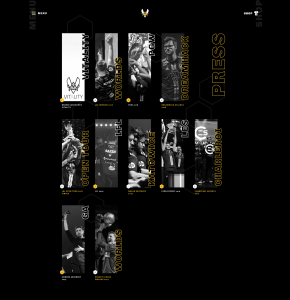
Are people talking about your organization? Maybe include a press section on your website. And on this page include a press kit. A press kit will tell the press information about your organization and how you want that information displayed. Team Vitality does this remarkably well!
Community
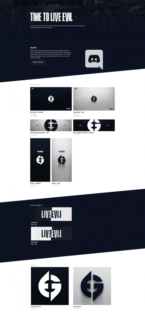
Evil Geniuses has a page on its website dedicated to its community. For example, they publicize their Discord server and wallpapers that anyone can download. I wish more organizations would have downloadable wallpapers for their team.
Footer
Lastly, it’s best to have an organized footer with the information people are looking for. When I go to the footer of a website, I am looking for social media links, a press kit, FAQs, or more straightforward navigation. I have noticed that some people include a link to their Career page if that is something you want to make available. The footer usually is where people put their Terms of Service and Privacy Policies.
Conclusion
When you are designing a website, keep in mind that humans will be using it. Having relevant information that is easy to find will help your website perform. Try to think of how you would want a site to function. It’s the Golden Rule or something.
Disclaimer
I want to be transparent with you. As with anything, this blog has an agenda. If it helps you build your website, perfect. However, let’s connect if you do not want to design a new website. At Exothermic, we want to help you succeed, and I like to build websites, so let us do it with you.
